It almost seems like New York City in the 1950s existed only in black and white. Images from the era capture a soon-to-be iconic skyline casting deep shadows over busy city streets populated by stylish women in white gloves and purposeful men in gray flannel suits.
What isn’t pictured is what was just around the corner and fast approaching: The gender-bending, counterculture, Pop-art movements that would revolutionize the city and nation, thanks in no small part to Andy Warhol.
Warhol would become a central figure in America’s shifting sensibilities. But in the ’50s he was just trying to find his way in an unfamiliar city.
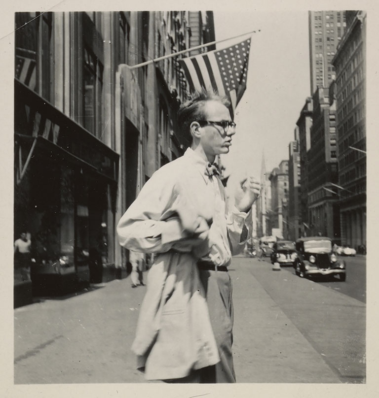
Philip Pearlstein, Andy Warhol in New York City, c. 1949, Philip Pearlstein papers, Archives of American Art, Smithsonian Institution
Adman: Warhol Before Pop, on view at The Andy Warhol Museum through September 2, explores how that singular time and place would help form the singular artist. Developed in conjunction with the Art Gallery of New South Wales (NSW) in Sydney, Australia, where it debuted last year, Adman features Andy Warhol’s earliest works both as a successful commercial illustrator and as a struggling fine artist.
“The exhibition offers a more complex, much richer understanding of the invention of Andy Warhol,” says Nicholas Chambers, the Art Gallery of NSW’s senior curator of modern and contemporary international art, who also worked at The Warhol. “The last truly comprehensive show dedicated to this period was back in 1989. Since then, many more discoveries have been made that can reveal these formative years to a new generation.”
“If you know this decade then you know all the future versions of Warhol. What he was doing in the ’50s put him in a position to be the unique artist, the celebrated artist he would become.” – Jessica Beck, The Warhol’s Milton Fine Curator of Art
Although there’s a certain fairy-tale quality to the story—a young man from humble circumstances goes off to the big city to seek his fame and fortune and finds both in abundance—it’s hardly a simple rags-to-riches parable. Even before heading off to New York in the late 1940s with little more than a degree in pictorial design from Carnegie Tech (now Carnegie Mellon University) to call his own, Andy Warhola set out to make a name for himself. Literally. After considering several variations—including A. Warhola, André Warhola, and even Andy Morningstar—he opted for the relatively unadorned moniker Andy Warhol.
“If you know this decade then you know all the future versions of Warhol,” says Jessica Beck, The Warhol’s Milton Fine Curator of Art and organizer of the Pittsburgh show. “What he was doing in the ’50s put him in a position to be the unique artist, the celebrated artist he would become.”
If the shoe fits
What the 20-something was doing was looking for a way to get hired as a commercial artist. Seemingly at odds with his timid persona and “Raggedy Andy” reputation—based on his less-than-high fashion sense—Warhol was nothing if not a self-starter. He quickly began knocking on doors, an approach he learned from his mother, Julia. A folk artist, she sold metal flowers fashioned out of fruit and vegetable cans door-to-door. A young Warhol and his two brothers would watch from the bushes.
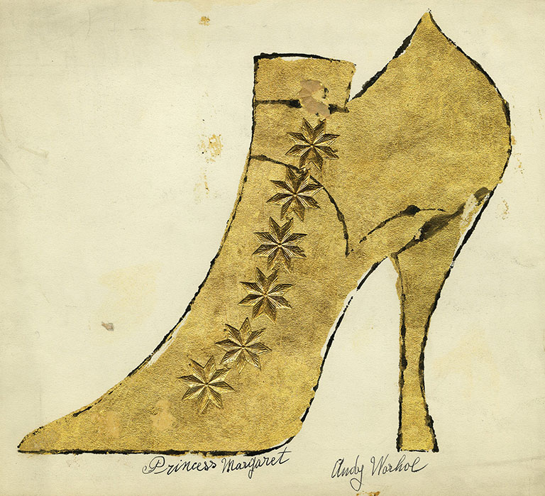
During Warhol’s first decade in New York, shoes, album covers, and women’s fashions dominated his commissioned commercial work and artistic projects.
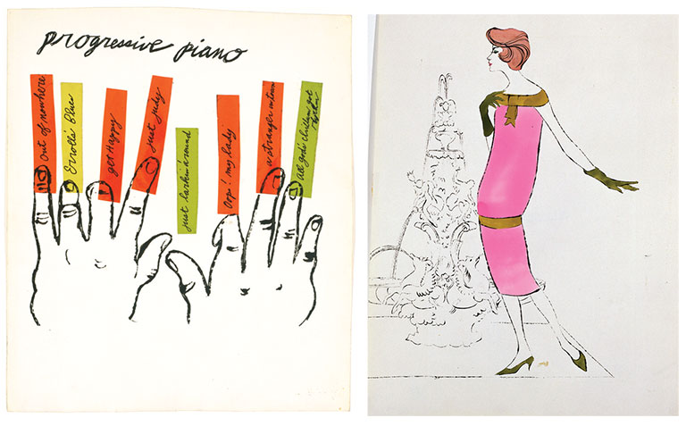
Andy Warhol and Julia Warhola, Princess Margaret, ca. 1957; Andy Warhol, Progressive Piano, 1950s; Female Fashion Figure, 1950s. All images: The Andy Warhol Museum, Contribution The Andy Warhol Foundation for the Visual Arts, Inc. © The Andy Warhol Foundation for the Visual Arts, Inc.
“It was hot that summer, long before air conditioning came into use,” Warhol’s roommate in New York and fellow Carnegie Tech graduate artist Philip Pearlstein wrote in 2014 in ARTnews. “Andy’s main interview clothes were a heavy white corduroy jacket and trousers, and he always wore a bow tie. On his first appointment, he told the receptionist that he was about to faint and asked for a glass of water. The whole staff scurried around to make him comfortable. He wondered if he could use that routine again.”According to art critic and Warhol biographer Blake Gopnik, this “aw-shucks” sensibility was a facade.
“People underestimated Warhol,” Gopnik says. “There are all those stories of him wearing utterly scruffy clothing, but then there are photos of him from the same time period in fashion-forward suits.
“He was tremendously intelligent and well-read. He would act silly, but that was just a pose,” Gopnik adds.
Pose or not, Warhol’s door-knocking campaign paid off.
“On Andy’s fourth or fifth day of interviews,” Pearlstein wrote, “he landed a major assignment for an important fashion magazine: a full-page drawing of several women’s shoes on the rungs of a ladder.”
“It’s fascinating how all the traits and characteristics of his work start to take shape in an important way. There’s intimacy. There’s a real eye for layout, design, and color formatting. There’s a process of volume and speed. There’s a use of photography.” – Jessica Beck, The Warhol’s Milton Fine Curator of Art
That assignment was for Glamour magazine, and its art director, Tina Fredericks, remembers it well. Over the years, she’s been quoted often about meeting this pale, blotchy boy clutching a big, black portfolio case that, back in 1949, was pretty light in content. But one whimsical drawing of an orchestra intrigued her enough to ask how much he wanted for it. Fredericks, who just happened to be five months pregnant at the time, thought it would be a great addition to the nursery she was planning.
Warhol gave it to her for free.
“His ink lines were electrifying. Frag-mented, broken, and intriguing, they grabbed at you with their spontaneous intensity,” Fredericks said of the illustration.
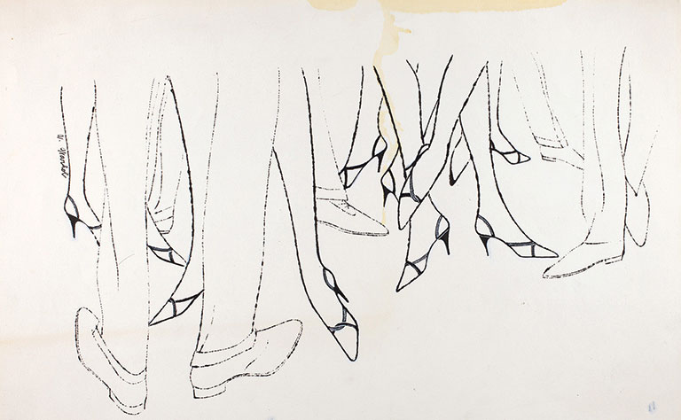
Andy Warhol, Men’s and Women’s Legs and Shoes, 1955, The Andy Warhol Museum, Contribution The Andy Warhol Foundation for the Visual Arts, Inc. © The Andy Warhol Foundation for the Visual Arts, Inc.
That electricity was the product of Warhol’s blotted-line technique, a type of line drawing combined with basic printmaking that he developed during his Carnegie Tech days and was still perfecting. It allowed him to create a variety of illustrations along a similar theme, presenting clients with multiple ideas at once, distinguishing him from the competition.
“It’s fascinating how all the traits and characteristics of his work start to take shape in an important way,” Beck says. “There’s intimacy. There’s a real eye for layout, design, and color formatting. There’s a process of volume and speed. There’s a use of photography.”
Warhol often used Edward Wallowitch photographs as the basis for his blotted-line drawings, a dubious practice at the time, says Gopnik.
“He would borrow piles of photographs from the New York Public Library and not return most of them,” Gopnik says. “He didn’t want anyone to have access to them.” He didn’t want anyone to know that they informed his own work.
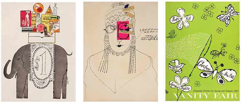
Andy Warhol, Black Portfolio (containing tear sheets of Andy Warhol’s commercial work), 1950–1960, Founding Collection; Demande Réponse, 1950s; Vanity Fair Promotion Preview for Spring and Summer, 1962, Founding Collection. All images: The Andy Warhol Museum, Contribution The Andy Warhol Foundation for the Visual Arts, Inc. © The Andy Warhol Foundation for the Visual Arts, Inc.
Fredericks liked what she saw and wondered what else the kid could draw. Anything, he replied. Soon, Warhol was getting regular assignments—and checks—from Glamour. Other women’s publications including Harper’s Bazaar, McCall’s, and Vogue followed. Before long, his list of clients grew to include record labels and high-end retailers such as Tiffany & Co., Bourjois Perfume, the leather-goods company Fleming-Joffe, and, most notably, I. Miller Shoes. From 1955 to 1960, Warhol produced some 300 illustrations of women’s shoes for I. Miller, including a series of full-page ads that would regularly appear in the Sunday New York Times.
A gay pioneer
Warhol’s commercial work, often punctuated by angels, cupids, butterflies, and flowers, and accompanied by the swirly, handwritten script of his mother—who by 1952 was living with her son in New York City—ran contrary to the hyper-masculine sensibilities that defined Madison Avenue.
“I’m struck by how feminine this first decade is for Warhol,” Beck says. “Not only is he operating in this very feminine world, but the hand he was using for his illustrations was also very sensitive. He felt comfortable in this space.”
The ease and confidence he expressed in his commissioned pieces enhanced his appeal. “He was deliberately effeminate,” Gopnik says, noting that when permitted by clients, he signed his commercial work, unlike many artists with similar ambitions. “He was using a gay aesthetic to sell femininity to women. That gender crossover made him attractive.”
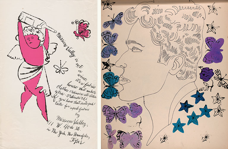
Andy Warhol, Mission Valley Mills, 1950s; Whole Sketchbook: Male Portrait, Male Portrait With Stamps, 1950s, The Andy Warhol Museum; Founding Collection, Contribution The Andy Warhol Foundation for the Visual Arts, Inc. © The Andy Warhol Foundation for the Visual Arts, Inc.
But in society at large, gender roles remained unambiguous. Once World War II ended, women were expected to return to the home front and leave the business of work to men. And men who were gay were expected to keep it to themselves.
Not surprisingly, Warhol didn’t play by the rules of society, nor by the rules of the New York School, a loose affiliation of the Abstract Expressionist painters of the day, among them Willem de Kooning, Jackson Pollock, Mark Rothko, and Robert Motherwell.
As a figurative artist, a commercial artist, and an openly gay man, Warhol found himself on the outside looking in. His early gallery collections of paintings, drawings, and sketchbooks of young men and erotic male nudes were not a hit. “They fell absolutely flat in the world of fine art,” Gopnik says.
“He was deliberately effeminate. He was using a gay aesthetic to sell femininity to women. That gender crossover made him attractive.” – Blake Gopnik, art critic and Warhol biographer
According to the exhibition’s catalog, reviewers criticized his 1956 Studies for a Boy Book drawings for their “doubtful taste” and “private meaning,” and referred to them as “highly sensitive”—one even calling them “fragile impressions [of] carefully studied perversity.” But Warhol was undeterred. “Warhol was an ambitious and eager artist who wanted desperately to succeed as a fine artist,” says Gopnik.
“The essential takeaway was that content mattered more than style,” he adds, noting that Warhol worked in a manner that he shared with other illustrators of his era. “That’s what Warhol carried over to his Pop art. Art shouldn’t look ‘arty.’ The Campbell’s soup can should look like it’s been transplanted from the kitchen to the canvas. The Marilyn Monroe portrait should look like it’s been transplanted from the pages of a magazine to the canvas.”
So, as the ’50s gave way to the ’60s, and commercial illustrations gave way to professional photography, Warhol took a calculated leap of faith. Although he decided to forsake his commercial business to pursue his art, it was never an all-or-nothing proposition.

Andy Warhol, (Stamped) Basket of Flowers, ca. 1961. The Andy Warhol Museum, Contribution The Andy Warhol Foundation for the Visual Arts, Inc. © The Andy Warhol Foundation for the Visual Arts, Inc.
“He thought about it in a very strategic way,” Chambers says. “Just as Warhol had a fine-art practice and gallery showings throughout the ’50s, he continued to take on commercial clients throughout his career.”
Perhaps it’s the knowledge that success did not elude Warhol that makes the Adman show so captivating. Visitors get an up-close look at the process—the choices made, the risks taken—of Warhol becoming Warhol.
With some 300 items on display, there’s plenty to see. Museumgoers will find his original drawings, artist books, and commercial and private art projects, as well as Warhol’s first business card. They’ll also see recreated window displays designed for Fifth Avenue’s Bonwit Teller, his design awards, personal memorabilia from his 1956 world tour, and drawings produced with the help of his biggest supporter, Julia.
For the Pittsburgh show, Beck dug deep into the museum’s collection and archives to add a few special touches for Warhol’s hometown crowd. She’s augmented the top floor to include many more family photographs, some early drawings on view for the first time, and two drawings on loan from Carnegie Museum of Art. “These are college drawings of zoo animals, and one is of a monkey that looks like a Julia Warhola cat,” Beck says. “They’re really lovely, really peculiar, and have a lot of personality.”
Personality is one thing, talent is another. “The work from this era is undeniable,” Beck says. “It stands up today. It looks so contemporary, so fresh, and still so relevant.”


