To arrive at the perfect wall color, a small team at Carnegie Museum of Art—curator, exhibition designer, and graphic designer—begins by discussing the desired mood of a gallery, how it will fit within the overall installation, and how to make the artwork stand out.
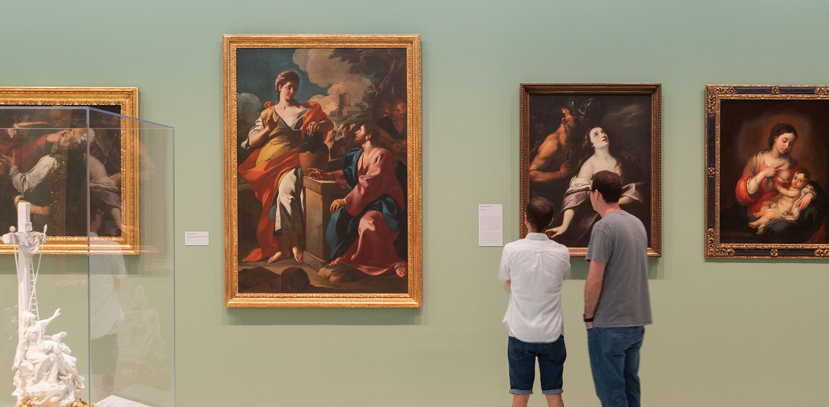
“The best color choices enhance the artwork, not detract from it,” says exhibition designer Emily Rice. “Traditional colors can really make historic work pop. Artwork with rich, heavily gilded frames can hold up to bold colors. When that boundary disappears on contemporary artwork, creating contrast is a little trickier and more important.”
Landing on the ideal neutral—the just right shade of pale blue or taupe, for instance—can be especially challenging. For the installation currently on view in the museum’s Forum gallery—comprised of small, unframed works with black text on a white background—Rice sampled five shades of gray for the wall color. “The gallery has a dark stone floor with a lot of tone to contend with,” she says.
Other times, says Rice, she knows exactly what color she’s looking for—inspired by a specific work of art or everyday object—and she just needs to put her finger on it among the thousands of colors offered. She’s a regular at the PPG Paints store in the Strip District. “I get 12 cans at a time if we’re dealing with two exhibitions. I’d rather put in the extra work up-front.”
To find the perfect hue, Rice applies paint samples to portable boards that have the same texture as the gallery walls because highlights and shadows alter how the color reads. Then she takes them into galleries or art storage to see how the color will work with specific artworks.
The use of color can be a strategic tool to guide or pace the visitor. The bold pink and green combination in a recent exhibition featuring neoclassical and Romantic art helped organize it into three distinct sections. The color choices “were over the top” at the request of the curator, says Rice. “When it makes sense, it’s fun to experiment.”
Some artists specify a preferred wall color. In other cases, Rice uses a learned trick of the trade: She doesn’t reveal the names of paint samples. “I try and conceal the name because I don’t want it to get in the way of a good color,” she says. “It can shift perception.” Case in point: PPG dubbed a lovely muted coral Shrimp Salad. “Thename turned stomachs.”
Once they’re up on the wall, Rice does share the names with visitors who call and ask. The shades of
teal, orange, yellow, and pink that were the backdrop for mass-produced objects by industrial design pioneer Peter Muller-Munk were especially popular, she says.
In the end, though, Rice thinks the most successful supporting color doesn’t leave a lasting impression. “You almost want it to go away entirely. You want visitors thinking about art, not paint.”
What are you curious about?
We’ll investigate what you’ve always wanted to know about the four Carnegie Museums. Write to us at carnegiemagazine@carnegiemuseums.org.
