Back
kid
size
By Lorrie
Flom
Kid-sizing products for children
is an art, a science, and a business
all its
own. A new exhibition at Carnegie
Museum of Art sheds light on the unique world
of children’s design and gives
kids of all ages plenty to think about.
A four-year-old girl pedals her Big Wheel faster and faster,
skids and spins to a stop, and lights up with a 1,000-watt
smile. This scenario has been repeated millions of times
since the Big Wheel was introduced to the world at the
1969 New York Toy Fair. This injection-molded plastic pedal
toy literally turned the tricycle industry upside down
by flipping the classic tricycle over, making it safer,
and allowing children to do more tricks. “The Big
Wheel is a good example of what I call a ‘design
moment,’” says Elisabeth
Agro, assistant curator of Decorative Arts at Carnegie
Museum of Art. “It literally pushed traditional metal
pedal toys to the curb because it combined fun, safety,
and affordability.”
In the exhibition kid size: The
Material World of Childhood, which runs through September
11 at Carnegie Museum of Art,
Agro has featured a number of these “design moments” that
changed the way adults designed products for and thought
about children. The lively exhibition—which combines
doses of history, design, and kids-oriented activities—compares
and contrasts childhood objects dating back 300 years and
spanning many cultures. Some of the objects on view will
bring back pleasant childhood memories for adult visitors,
while others from earlier times and faraway places will
demonstrate how the distinctive needs of children long
went unrecognized.
Children’s design as an industry
didn’t begin
to take shape until the 1950s, explains Sharon Carver,
director of the Children’s School of Carnegie Mellon
University. In the United States, it was a time of peace,
prosperity, and a huge post-World War II baby boom. It
was the era of Dr. Spock and the blossoming of the notion
that society had the responsibility to provide social and
emotional support for children.
“During this shift in perception, companies began marketing directly to
children,” she says. “Over the last 20 to 25 years, it’s
become a whole separate market.”
Letting Kids Be Kids
“
From a design point of view, up to the 18th century, children
were considered little adults, and their furnishings were
the same as those for adults, only smaller,” explains
Agro. In fact, from the 15th century until the late 19th
century, the whole purpose of baby walkers and walking
frames was to get babies into their “proper” standing
position so they wouldn’t crawl about like animals.
Today, few would argue that children are clearly different
from adults, both in how they behave and what they need
to thrive. But our current attitudes toward children
are as much a product of our relative wealth and comfort
as
they are a result of scientific research.
“
How society views children is cyclical, based on the times
and cultural beliefs. It isn’t a straight-line evolution,” says
Heidi Feldman, MD, a child development specialist at Children’s
Hospital of Pittsburgh. “If a society is stressed
through famine, depression, or war, children are asked
to mature very quickly, as in the United States in the ’30s
through the ’50s.”
Dating much further back
in history, Feldman points out that artwork can provide
interesting insights into society’s
views of children. In paintings from the Middle Ages, children
were painted to look like miniature adults. Yet during
the Renaissance,
a time when more prosperity allowed society’s view
of children to soften as the toy-making industry was born,
artists portrayed children as rounder, plumper, softer,
and more realistic.
If the Shoe Fits…
The industrial revolution did much to change the way products
were manufactured for ordinary people. Items that had
been custom-made for each individual
during pre-industrial times were now available for all,
often at a far lower price. Agro notes that mass production
was behind another design moment highlighted in the kid
size show—the bent beechwood highchair manufactured
by Gebrüder Thonet of Vienna. Thonet developed a new
technology that used steam to bend wood and became the
first successful manufacturer of mass-produced children’s
furniture.
 After
experimenting with various sizes, Thonet arrived at a formula
for designing children’s
furnishings at 70 percent of adult dimensions—and
priced them at 66 percent of their adult counterparts.
According to Agro, “Thonet could
have designed for kings, but chose instead to design for
the masses. His furniture was affordable yet beautiful
and reflected the current taste in design.” After
experimenting with various sizes, Thonet arrived at a formula
for designing children’s
furnishings at 70 percent of adult dimensions—and
priced them at 66 percent of their adult counterparts.
According to Agro, “Thonet could
have designed for kings, but chose instead to design for
the masses. His furniture was affordable yet beautiful
and reflected the current taste in design.”
Prior to the shift from
custom-sized to mass-produced products, no one bothered
to measure the people who would be using
the products—including the children—explains
Stephen Stadelmeir, associate professor and chair of Carnegie
Mellon’s Industrial Design Program. He explains that
it wasn’t until World War I veterans were being discharged
from the armed forces that their feet were measured for
boots. “The army realized that you can’t win
a ground war if boots don’t fit,” explains
Stadelmeir. And it was only about 50 years ago, he explains,
that a design subcategory called anthropometrics was developed
to study the actual sizes and shapes of people—both
adults and children.
This convergence of ideas—that
children were built differently than adults and their developmental
needs were
different as well—spawned an era of tremendous growth
in the children’s products industry that is thriving
today.
“
The idea that children’s work is play was a big change
in the 1950s,” says Agro, calling attention to another
design moment: the wooden “mechanical horse” designed
by Charles and Ray Eames in 1944. According to Agro, the
horse is an early example of a toy that exemplifies the
idea that children like to use their imaginations. Decades
later, “Children’s design has taken
center stage,” says Agro, “and many parents
want to surround their children with good design.”
Good Design vs. Cute Design
Mark Baskinger, assistant professor at Carnegie Mellon
University’s School of Design, applies and teaches
a “
user-centered” approach to all design, including
design for children. “Our approach at Carnegie Mellon
places the end user, be that an adult or a child, at the
epicenter of the project. We don’t look at what will
sell best, but at what will best suit the end user’s
needs,” says Baskinger.
During the past few years,
Baskinger’s class has
worked on several projects for local children’s furniture
design companies. His students spent about half a semester
on the projects.
“
The overall approach was to design from the child's perspective—identifying
ways to enhance a child's interaction with other children,
their environment, and ideas,” says Baskinger. The
students’ prototypes were “field tested” by—who
else?—children. Baskinger’s students observed
kids at the Children’s School, which is the laboratory
school operated by the University’s psychology department,
while they used—or didn’t use—their prototypes.
 In one project, students set out to create kid-sized storage
for toys or clothes that would empower children to use
their own skills and abilities without needing to depend
on adults. One of the resulting products was a gently curved,
low-hanging, maple coat rack that encourages autonomy. In one project, students set out to create kid-sized storage
for toys or clothes that would empower children to use
their own skills and abilities without needing to depend
on adults. One of the resulting products was a gently curved,
low-hanging, maple coat rack that encourages autonomy.
Another project that focused on collaborative play resulted
in the “Interactivity
Table,” which combines a giant paper roll with easily
accessible markers to encourage working together and sharing
ideas. Baskinger says that when the prototype was placed
in the Children’s School, the kids walked right up
to it and immediately began drawing.
Standing on Pittsburgh’s
historic North Shore is another testament to good design
for children: the newly
expanded Children’s Museum of Pittsburgh. “We’re
atypical, compared to other children’s museums,” says
Jane Werner, executive director. “We think children
appreciate good design, just like adults do, and we don’t
do cute here.” Instead, the Children’s Museum
tries to create beautiful spaces for both children and
adults—what Werner describes as “good design
for all ages.” And they succeeded, having recently
won major accolades from the magazines Metropolis and Metropolitan
Home, as well as unprecedented attendance since the expanded
museum opened in early 2005.
Werner says that the museum
was redesigned based on the philosophy that playing with “real
stuff” helps
children to better understand the world in which they live.
On an ongoing basis, the museum’s design team creates
prototypes for all the exhibits, which are then tested
with children with the help of the University of Pittsburgh
Center for Learning in Out-of-School Environments (UPCLOSE),
now housed within the museum. Werner explains that the
UPCLOSE team studies how children learn in the museum environment,
watches the children interact with the exhibits, and then
makes suggestions and changes.
“
Designers have a responsibility to provide good play opportunities
for kids,” says Werner.
And that means providing kids with the kinds of toys that
tap their limitless imaginations. “When you think
about toys, blocks are a classic example of a wonderful
toy for young children. We want to be more about blocks,
not toys that limit your options and imagination, not toys
with just one answer.”
Enter the World of Childhood
 Innovation and imagination are inherent in many of the
objects within the kid size exhibition, which includes
some of the best-designed and most significant children’s
furnishings from around the world. Most of the objects
were selected by the Vitra
Design Museum in Germany, where the show originated. Others
were added by Agro to update the show while including more
American products. Innovation and imagination are inherent in many of the
objects within the kid size exhibition, which includes
some of the best-designed and most significant children’s
furnishings from around the world. Most of the objects
were selected by the Vitra
Design Museum in Germany, where the show originated. Others
were added by Agro to update the show while including more
American products.
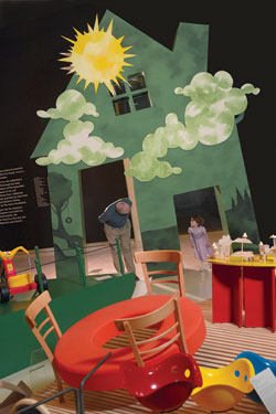
Using the good design principles behind
many of the objects in the show, Agro and a design team
also transformed the
exhibition into six playful environments that are distinguished
by theme, color,
and sound, and divided by custom-made 14-foot “houses,” each
with two doors—one sized especially for adults, and
another sized just for children. Agro believes that adults
walking through the exhibition—re-entering the world
of children through the six colorful custom-built houses—will
remember how it feels to be “small and carefree,
without any worries.” And children will unleash their
imaginations by designing their own furniture, testing
unusual toys, and doing what children do best: learning
through play.
Generous
support for the presentation in Pittsburgh of kid size:
The Material
World of Childhood has been provided
by members of The Associates of Carnegie Museum of Art
and the Henry L. Hillman Fund. Additional support has been
provided by Eat’n Park Restaurants and Parkhurst
Dining Services and by the Aetna Foundation. General support
for the museum's exhibition program is provided by The
Heinz Endowments, the Pennsylvania Council on the Arts,
and Allegheny Regional Asset District.
Back | Top |