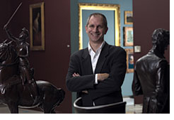
 Photos Photos
Ric Evans
Beyond
Convention: The Scaife Galleries’ New
Look Transcends Old Expectations
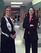
By Ellen S. Wilson
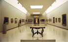
Visitors to the newly reinstalled Scaife Galleries
of Carnegie Museum of Art may not immediately see what
has changed. Their eyes may be drawn instead to the
snowy streets depicted in Childe Hassam’s Fifth
Avenue in Winter (ca. 1892). The painting has been
in the museum’s collection since the 1899 Carnegie
International, and visitors have had the opportunity
to see it many times. But now the white snow has a
dimension to it that has not been seen for a while.
The painting’s situation on a medium-toned Wedgwood
blue wall reveals a range of depths and moods that
Hassam intended when he painted it. “The snow
really pops out, which is what it should do,” says
curator of Fine Arts Louise Lippincott. “On a
white wall, it looks flat.”
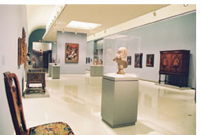
While previous installations of Carnegie Museum of
Art’s collection sought a shared way of presenting
the art, the new installation acknowledges that works
from earlier periods look best in historically accurate
settings. One of the many lessons derived from the
popular Panopticon exhibition was just how much more
appealing some of the older works are when they appear
on a suitable background color, and are exhibited in
close proximity to their contemporaries rather than
isolated on a long stretch of pristine white wall.
Incorporating some of these lessons has been the goal
of Lippincott, who presided over the reinstallation
of the 12 galleries that feature art before 1945.
“Panopticon taught us a lot of things we could
do differently,” says
Lippincott. “People liked the colors on the
walls, the group arrangements, the regional art.
We also found
that people liked to see competing works of art together.”
While previous installations conformed to the modernist
expectations of the 1970s and 1980s, “more recently,
the curators have successfully installed paintings
and sculpture in a more sympathetic and nuanced presentation,” says
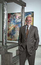
Richard Armstrong, Henry J. Heinz II director of Carnegie
Museum of Art. “This is the most important thing
to happen at the museum since the enlargement in 1974,” he
adds, referring to the initial building of the Scaife
wing of the museum almost 30 years ago. Gradual Enlightenment
“Almost any conventionally organized painting
has a range of dark, light, and medium tones,” explains
Lippincott. Manipulating those tones creates spatial
effects and highlights. “While Impressionists
moved away from classic dark and light, any painter
puts on a ground or a base layer as a neutral starting
point.” Hanging a painting on a wall that matches
that base displays the painting to best effect, hence
the brilliant snow of the Hassam painting. As a general
trend, grounds became lighter with more modern painting,
and eventually the spatial effects were discarded.
 Like
the paintings, the early furniture appears to
best effect with darker, warmer colors on
the walls.
End rooms in the Scaife Galleries are a deep plum, “a
good 19th century picture gallery color,” as
Lippincott says, a fitting showcase for pictures
in heavy gold frames. In the gallery devoted to
works dating back to 1600, the walls are soft Wedgewood
blue. Like
the paintings, the early furniture appears to
best effect with darker, warmer colors on
the walls.
End rooms in the Scaife Galleries are a deep plum, “a
good 19th century picture gallery color,” as
Lippincott says, a fitting showcase for pictures
in heavy gold frames. In the gallery devoted to
works dating back to 1600, the walls are soft Wedgewood
blue.
The collection is displayed chronologically
and starts
with a gallery devoted to Art before 1300, which
includes works from Asia, Egypt, Greece, and Rome.
As each room’s
contents become more modern, the color on the walls
lightens, passing through pale grey-blue until visitors
cross the threshold into Abstraction after 1945.
Here the spare white walls best display mural-sized
abstract
expressionist paintings by Franz Kline and Pierre
Soulages, or brightly colored, more minimal works
by Ellsworth
Kelly or Robert Mangold.
“In some ways, the progression parallels exhibition
sensibilities historically,” says Lippincott.
Metaphorically inclined visitors may muse on the significance
of this gradual enlightenment as they walk through
the centuries to the present day.
The last five galleries are given over to Abstraction,
Pop Art, Conceptualism, Minimalism, The Return
of Painting, and Art Now. These works will be
taken down to make
way for the 2004 Carnegie International, but
as Curator
of Contemporary Art Laura Hoptman says, “there
are a few notable additions that haven’t been
seen in the permanent collection galleries for a long
time.” Hoptman cites in particular Mathias Goeritz’s
cement painting Message IX, Job 9:29-"If I Be
Wicked, Why Then Labour I in Vain?" (1958-59),
as well as a small abstract expressionist painting
by Brazilian artist Maria Helena Viera da Silva.
The Works on Paper gallery is now a long, airy
space that befits the museum’s extensive collection
of drawings, prints, and lithographs. Works on paper
have more stringent lighting and environmental requirements
and are never put on view for very long. What We Learn from Juxtaposition
In planning the reinstallation of the Scaife Galleries,
some of what was well received in Panopticon was
incorporated into the new gallery plan, primarily
in the galleries devoted to works from 1820 to 1900. “Visual
harmony is not a major goal in this installation,” adds
Lippincott, and this is unusual. “We found
that people got so much out of contrasts and differences
that we decided we would continue to look for them.”
For
example, in European and American Art from 1850-1880,
one wall contains 15 of the collection’s best
landscapes from that period, lined up in chronological
order. “We have pictures hanging next to each
other that normally wouldn’t be in the same
room, if that is the way the dates work out,” says
Lippincott. “For example, we have a beautiful
Alfred Sisley landscape from 1881, the ultimate in
Impressionism, hanging next to a William C. Wall
view of Pittsburgh in 1881, painted in a manner that
went
out of style 40 years earlier. With this arrangement,
you can compare Pittsburgh to France, or radical
to conservative, and it makes you look at both pictures
again in different ways.” Or, as Armstrong
says, “Juxtaposition
teaches us all kinds of new things.”
Another
gallery has a chronological sequence of figure
paintings from 1880 to 1900, nationalities
completely
mixed. And the opposite wall of both of these galleries
is hung salon style, incorporating different styles
and painters within a narrow historic range—20
or 30 years for each room.
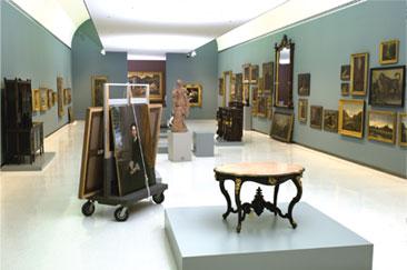
Objects from the Decorative
Arts collection are newly prominent, with larger
pieces of furniture
more prevalent
than small objects. “We’re introducing
pieces on a scale that is appropriate to the galleries
and the other works there,” says Sarah Nichols,
chief curator and curator of Decorative Arts. They
are placed chronologically as well, alongside fine
art from the same period, conveying a more profound
understanding of life and art from that moment. “We’re
not splitting things by cultures. There are chairs
from 1900 all on a big pedestal that will illustrate
the various movements that existed at that time.” Encouraging Leisurely Reflection
“One of the primary reasons for the renovations,” explains
Nichols, “was to make the visitor more comfortable.” To
this end, as the installation began taking shape, the
staff began strategizing ways to help visitors interpret
the art in its new space. Visitors to the renovated
Scaife Galleries will find new explanatory labels that
provide background information on the artist, the subject,
or the creative process, and books located alongside
new seating areas to encourage visitors to engage in
leisurely study.
“In addition to providing more labels and adding
an improved way-finding system with new signage and gallery
maps, we will be introducing new participatory strategies
over time designed to engage visitors in conversation,” says
Marilyn Russell, curator of Education. Several interactive
stations will be placed throughout the galleries to
offer visitors opportunities to respond to works of
art in words or drawings just as they did in Panopticon. “Our
hope is that by providing opportunities for visitors
to react to the works of art at the interactive stations
or while resting in one of the new seating areas, people
will feel more comfortable in the galleries. They will
stay longer and enjoy discussions about the art with
the people they came with, and even with people who
have come before them,”
she adds.
In addition, a new audio guide will be available
at the museum admission desk by early November. The
audio
guide provides information on more than 100 works
of art, including 20 new works of art that have not
been
on view in over a year. The guide allows visitors
to choose a route through the galleries and listen
to
recorded comments on the works of art that interest
them most. There are even some entries designed specifically
for kids and families narrated by Art Cat, the museum’s
mascot for children’s programs. A selection of
about 24 works have been indentified as a recommended “short” tour
of the collection for those visitors who have less
than 45 minutes to spend in the galleries.
“Our new strategies for engaging visitors take into
consideration a wide variety of learning styles,” says
Russell. “But they are all designed to provide
visitors with an experience that will stimulate reflection
about the art, help them become more familiar with
the museum’s permanent collection and encourage
them to come back often,” adds Russell.
Light and Air
 The renovated galleries should also feel more comfortable
than they did in the past, in that they will always
feel exactly the same—a relative humidity of
between 45 and 55 percent on the driest February day
as well as the most humid day in August. This consistency
is due to new equipment in the basement mechanical
room, a vast, humming cavern filled with enormous ductwork
and new white pipes dedicated to treating the air.
The noise is in sharp contrast to the steady, controlled
quiet of the galleries. The renovated galleries should also feel more comfortable
than they did in the past, in that they will always
feel exactly the same—a relative humidity of
between 45 and 55 percent on the driest February day
as well as the most humid day in August. This consistency
is due to new equipment in the basement mechanical
room, a vast, humming cavern filled with enormous ductwork
and new white pipes dedicated to treating the air.
The noise is in sharp contrast to the steady, controlled
quiet of the galleries.
Of all the work that has been done to renovate
the galleries, the most important and least
noticeable may be lighting. Edward Larrabee
Barnes originally designed Carnegie Museum
of Art with numerous skylights and dropped
ceilings that would evenly diffuse the natural
light. The new lighting is still a mix of the
natural, clerestory light and artificial track
lighting, but the levels are a little lower.
“We took great pains to get the color balance in the galleries right,” says
Chris Rauhoff, director of Exhibitions. Natural light tends to be about 5,500
kelvin, which is in the blue range, and artificial light, in the red range, is
from 3,000 to 3,600 kelvin. “Those two temperatures are joining at the
picture plane. Sunlight is perfect, because it renders all color in a uniform
and true manner.”
Shouting Down the Centuries
Today, the Scaife Galleries are arranged in
such a way that, as Lippincott points out,
Willem de Kooning’s abstract figurative
painting Woman IV (1953) is directly opposite
the 18th century neoclassical portrait The
Honorable Mrs. Trevor (Viscountess Hampden)
(1779-1780) by George Romney. The six galleries
that separate them in time represent approximately
200 years of art, but leave their view of
each other unobstructed. One could imagine
the artwork yelling witticisms (or criticisms)
when the lights go down and the doors are
locked.
Art is always about conversation,
across the decades, among stylistic traditions,
between
artist and viewer, or visitor and curator.
This next installment—a chapter in the
history not only of the collections, or art
in general, but also of Carnegie Museum of
Art’s dialogue with the people of this
region—should provoke a lively give-and-take
for years to come. n
Back to Contents
|