 |
|||
|
|
|
|
|
 |
|||
|
|
|
|
|
|
| In 1981, Andy Warhol
created a memorable series of images depicting Mickey Mouse, American icon.
Or, as Warhol called him in the title of a group of four Mickeys embedded
in a field of celestial blue, a myth: Myths: Mickey Mouse. That there are
four Mickeys in Warhol's seminal painting suggests the ubiquity of the
mouse which, according to company mythology, was invented by Walt Disney
in 1927 on a westbound train, after Disney's New York distributor stole
the rubbery rabbit who was his current cartoon star. Mickey's virtue was
that he was only a couple of circles perched on pipestem legs, a composition
easily drawn by anybody with a pencil; the business of making animated
cartoons was an assembly line process, a commercial art alluded to in Andy
Warhol's multiple Mickeys, laid down on canvas with a silkscreen that facilitated
the act of factory-like replication. There was, strictly speaking, no Mickeyonly
Mickeys. Lots of 'em.
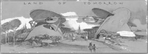
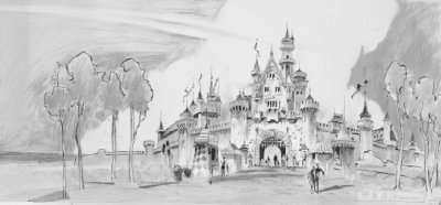
As the persona of Mickey Mouse evolved through the years, he became rounder and rounder, as plump as a cream-filled doughnut, and as soft as a sofa cushion. The circles circumscribed Mickey psychologically, inhibiting the development of his character on the one hand while making him into a kind of universal symbol of happiness and innocence on the other. Finally, it became almost impossible to make an interesting Mickey Mouse cartoon because the hero was just too darned nice: he could only smile and giggle when Andy Warhol painted him in sets of two and four, or all alone, as a portrait bust with a bright red background, isolated, frozen, and turned into into myth by his own undeviating pattern of sweet, suggestive circles. Breasts. Puffy clouds. Lollipops. And everything nice.  Andy Warhol may well have pondered the tight relationship between form and Freudian content that made Mickey mythic. But it is very unlikely that Walt Disney did so, despite the connections between shape and emotion implicit in the architecture of the theme parks he invented in 1955, with the opening of Disneyland in Anaheim, California. From that moment forward, all the Disney parks have had a roughly heart-shaped plana Valentine configuration. And at the center, a circular hub, from which the visitor can choose to enter any of the constituent "lands"Adventureland, Fantasyland, Frontierland, Tomorrowlandthat make up the theme park. And at the center of each hub (and of each land as well), a tall vertical whoozits that Walt called a "wienie." In Midwestern parlance, that meant a hot dog, an unimaginable treat for a poor Kansas City paperboy, something so delicious and irresistible, you just had to have it. In the parks, the wienie meant that the visitor walked toward the castle, that she steered herself through space with the aid of prominent and attractive landmarks, all clearly visible on the skyline. Disney got the idea from the étoiles of Paris, with their triumphal arches and obelisks, or precisely what made Paris a comfortable, walkable city. Disneyland, too, was meant to be a pedestrian paradise, a rebuke to the rampant automobility and suburban sprawl of Los Angeles. It is one of the great ironies of Disney's vision that the Santa Ana freeway, zipping past the corner of Adventureland, was the reason Disneyland was built: the highway afforded ready access to the park for a generation of car-mad post-war Americans who loved tail fins. Yet once inside the park, the driver became a pedestrian, walking shoulder to shoulder with his fellow tourists toward the fairytale castle at the center of the plan. For an audience increasingly isolated in its two-toned Chevies and its new tract houses, Disneyland used the form of the "wienie" to create the momentary illusion of a civic life.  The Disney parksDisneyland, in California; Walt Disney World, in Orlando, Florida; Tokyo Disneyland; Disneyland Parisrely on form and color and scale to provide comfort and reassurance. In contrast to the typical city, where every building competes with its neighbor to capture the business of the passerby, the storefronts of Main Street U.S.A., at the entrance to Disneyland, are all of a piece, carefully harmonized in color to suggest a unity, a sense of peace at odds with the usual urban cacophony. In the city, buildings rise to dizzying heights; they dwarf the citizen on the sidewalk, making him seem small and powerless in the face of corporate might. On Main Street U.S.A. in all the Disney parks the buildings have been designed using a theatrical technique called "forced perspective": the ground floors are almost life-size but as the eye moves up the facade, the upper stories grow progressively smaller. The effect is to shrink the city to manageable scale. Adults feel much as children do when playing with doll houses; they acquire a subtle sense of mastery over the physical world. The cold mercantile street suddenly feels cozy and domestic. If you can't get lost, thanks to the wienies, and if, instead of intimidating you with their grandeur and size, these buildings fit the user like an old slipper, then you have been properly reassured. Unlike the cityscape of the typical urban agglomerate, this one has been conceived with your feelings uppermost in mind. So, instead of building theme parks from the usual plans and blueprints, the Disney Imagineers (another Walt-ism: imagination + engineering know-how = Imagineers, or the people who plan and make the parks) use pictures. Or elaborate paintings that show people actively responding to the places depicted. Wannabee cowboys swagger down the dusty streets of Frontierland, admired by make-believe Tom Sawyers. Little fairy princesses (and their parents) scamper out of the Sleeping Beauty castle. It is only later, when the mood and feeling of the place has passed muster, does someone figure out if a building that looks like this can accommodate a planned attraction, and if so, how. This is painterly, pictorial architecture, built to tell stories that include the vacationers shown in the preliminary sketches. The buildings are movie sets, with you and me as the actors. The stories in which we are invited to participate are the ones we learned at the movies. In Fantasyland, the theme is the repertory of Disney animated features, from Snow White and Peter Pan to Alice in Wonderland. The "dark ride," which Disney appropriated from the Tunnel of Love at a thousand seedy amusement parks, is a good example of how the visitor is invited to step through the screen in a darkened theater and into the movie. Snow White's Scary Adventure, in its original form, consisted of a story-book facade that functioned like a movie marquee; once inside, little wooden carts carried passengers deep into the diamond mine of the Seven Dwarfs, and finally, to a confrontation with the Witch. But without the spectator, the story was incomplete: the person in the cart was Snow White, for whom the dwarfs labored and against whom the Wicked Stepmother plotted. In Adventureland (the theme here came from the Disney library of nature documentaries), the Jungle Cruise copied the river trip of Bogart and Hepburn in The African Queen, with the tourists now in the lead roles, attacked along the way by plastic hippos rising out of the water on cue. Movie-set architecture set the scene for the participatory dramas that are what theme parks are all about. Narrative. Legend. And myth. Until recently, all this emphasis on storyline and urbanism had shortchanged Mickey Mouse. Although he was the cornerstone on which the Disney empire rested, and a potent symbol of the company's products, Mickey was strictly a guest in the parks, a tourist like everybody else. That changed in 1991 and 1992, when construction began on Mickey's Toontown, a kind of Main Street U.S.A. for Mickey, Minnie, Goofy, and their associates. The artist assigned to the project soon realized that the old Mickey cartoons were not going to be of much help in figuring out what kind of house a 'toon ought to live in. For the most part, the accommodations pictured in the cartoons were boring, meaningless, real-world houses, reduced to mouse- or duck-size. The alternative was a wholly new architecture, derived from the forms of the characters themselves, an architecture made, as it were, of silly putty and smiles, and predicated, not on right angles, but on circles. A house as round as Mickey! What an idea! But tell that to a contractor. Every morning
the Imagineers would come back to the site to find all their squishy walls
straightened up, all their bulging beams squared, their meandering roofs
tiles lined up in neat rows. In the end, Mickey-ness prevailed, of course.
Toontown is a kind of Warhol portrait of Mickey without the mouse, executed
in bright kindergarten primaries, an essay in circles and curves, ovals
and an omnipresence that has impressed this character into the very fabric
of American life. As Andy Warhol suggested, Mickey is the essential American
myth. (And before you dismiss that notion, just count the number of Mickeys
in your house!) Warhol's work argued that myths and symbols like these
deserved closer scrutiny precisely because they were everywhere. The Architecture
of Reassurance makes the same case for the fictive architecture of theme
parks, or the emotive style in which malls and restaurants, rehabed neighborhoods
and new planned communities are being built today. It is the vernacular
environment of America today. And it all started with a mouse.
Karal Ann Marling is a professor of art
history and American studies at the University of Minnesota, and the curator
of The Architecture of Reassurance: Designing the Disney Theme Parks.
The exhibition was organized by the
Canadian Centre for
Mickey-legs display case,
|
|
|
|
|
|
|
|
|||